 Jackal Ryder
heya guys, it's been a while....here's my latest work:
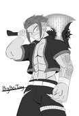
i redesigned an old OC of mine, Qianhe the cyborg martial artist.
as you can see, he used to look lame, with his stiff,unnatural and preety lame pose, he looke like he was trying too hard to look intimidating.
his proprtions were also off, with his arms being too thin and short while his head was too big.
his second pair of arms also used to look lame, being attached to his back and one hand being the wrong way.
his body was also too overdesigned for my taste, it looked to me like i was just trying to pad his body with unessesary details that actually harmed the overall esthetic.
his color palette was also not really good, the grey of his body was too dark, and the dark grey of his pants too light. plus there was too much yellow on his body, and the blue was preety rare.
his hair was also bad, it looked messy with the details i out in it.
that's why i worked on theses issues and reworked his design a bit:
-i removed all the unnessesary yellow details, and replaced them with blue muscle fibers, wich makes more sense since he's a cyborg,
-i reworked his proportions to be much better overall and make him look like a young man with a sturdy body,
-i reworked his pose to be far more dynamic and logical for a martial artist, now he looks like he's about to kick butts,
-his secondary arms are now floating and also gained a more epured design, with both fists in the correct position,
-i reworked his color palette to have the correct shades of grey for the pants and body, the blue of the muscle fibers is very light,almost neon to look like enrgy flows through them, and he's got blue eyes now.
and that's about it^^ i hope you like it^^
2021-03-20 00:54:11 +0000