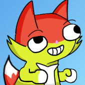
 CatFox
Remember when Nickelodeon would have like a trillion different variations of it's logo? Sure we all remember the classic splat logo but Nick used updated the channel's screen bug for certain events or just for fun. The designs ranged from variations of the classic splat, a wrench, a turtle, a TV, a UFO Toothpaste ECT (Even some 3D ones). Nick also made little orange silhouettes to go along with the Nicktoons as seen in this tweet here. https://twitter.com/Destructo_Dan/status/1284183021286035459
I think starting in the mid 2000's it's stopped being and more so with the modern logo just being text. It's not much but I wanted to make a little logo silhouette for some of the current shows starting with It's Pony. I chose a pretty obvious one with the chess knight being a horses head, but what else would be fitting (other than a horse shoe, but How'd one get the Nickelodeon branding on that is beyond me.) Well their is a barn or a silo but that be just a fitting for Back At the Barnyard. Anyways might do some more Logo design work in the future.
2020-08-09 00:12:06 +0000