 Tuliharja
2014 VS. 2022
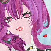
I had already decided to redraw this (illust/120196493) Mito drawing back in 2014 when I had originally made it. Why? Because the moment I started to color it back then, I knew it would be bad. I can't remember why I went through with that all, since I knew it wouldn't turn out well.
I remember I struggled to decide what to color Mito's eyes as in manga her eyes are more and less pitch-black and let's be honest: making eyes that don't have light dots or if you can't place them just the right way when making fully black eyes will look...well, not so good. I could have ignored the manga's coloring and gone with the green one (like in that anime opening), but for some reason I had that 'brilliant' idea to go with black eyes...it then spiraled to that I tried to play with the light and decided to put a shadow on that side of her face where the light should have been, making the whole lightning on her just look awkward. Not to mention the colors are very off in that original work and the scanner ate most of those, making the picture very grainy... But I just wanted to get over with the picture, but the moment it was finished and I had posted it in my DA I knew I would redo it at some point. (No questions asked.)
So, here it's! My redo version of the old traditional one. I used the base of the traditional one when creating this new, digital one. When I started to draw the new version, I also wanted to test a different style from my usual one starting from lineart. The lineart is done with several different digital ink brushes and with coloring I used digital watercolor brushes. (While the aftermath doesn't exactly look like watercolor's, it still resembles it somewhat.) All in all, it was very fun to experiment with different brushes that I wouldn't normally use or just an only a little bit. (I had to hold myself back when I wanted to 'correct' the aftermath of some brushes...)
With the redo version, I fixed the lightning/shadow problems, decided to stick with green colored eyes with Mito (that look very good on her!), and tried to bring more texture to her.
I also tried a bit different style from my usual one, by trying calligraphy brushes and a 'rougher' style when painting this. I'm quite happy with how some of the ending results' textures turned out.
I'm sure there are still parts that I could have done 'better' or differently, but I think the redo version looks much better than the old one. Or, at least I hope it does. What do you think?
Mito Uzumaki © Masashi Kishimoto
Artwork © Tuliharja
2024-08-06 12:59:28 +0000