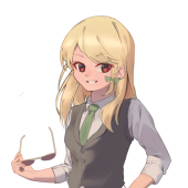
 Wine_Sparrow
Hi guys, sorry for the repost. It seems that PIXIV requires premium to edit posted work, hence I could only post the editted version in a new post.
This editted version contains a lot more details and its colors are adjusted as well. I hope this one could bring out a more balanced feeling than the earlier version. Honestly, adding details is a really fustrating task. While it is really hard to figure out how to draw them, adding few of them really changes the feel of the graph in a weird way. Like this one, after adding the deatils on the waist, it feels extremely strange as the waist has just too much details in one area and it repels with the entire graph. I guess that I should plan out how detailed each area should be during draft phrase, in that way, this weird issue might be mitigated.
Btw, just wondering, when you first saw this character, could you tell that it was actually Alice. I actually felt that actual Alice might look more confident than this one. Do you feel this one is a bit too away from original alice?
2023-02-16 12:24:29 +0000